Personalization is an important part of user experience (UX) design because it lets interfaces adapt to each user’s needs and preferences. AI can be used to find out how users act and change the interface to match. For instance, an AI-powered shopping site might suggest products based on what a user has bought or searched for in the past. Or, a social media platform might use AI to customise the content that is shown in a user’s feed based on their interests and interactions.
AI can do more than just make things more personal. Based on how users act, it can also guess what they require. For example, a virtual assistant powered by AI might be able to predict what a user wants and provide them with relevant information or suggestions before they even ask. This can help streamline the user experience and make it more efficient and intuitive.
Overall, using AI in UI/UX design can make the user experience better by making interfaces that are personalised and predictive and fit each person’s needs and preferences.
I have tried the AI-powered image generation service Midjourney. It can be used to create graphics and images for use in UI design. With information like descriptions or sketches as input, Midjourney’s AI algorithms can make realistic images or graphics that can be used in many ways. This can save time and effort for designers and also lead to creative and unexpected results. In addition to generating new images, Midjourney can also be used to manipulate or transform existing images, making it a versatile tool for graphic design tasks.
Overall, using AI-powered image generation services like Midjourney can help designers make and change graphics faster and better, which improves the user experience as a whole.
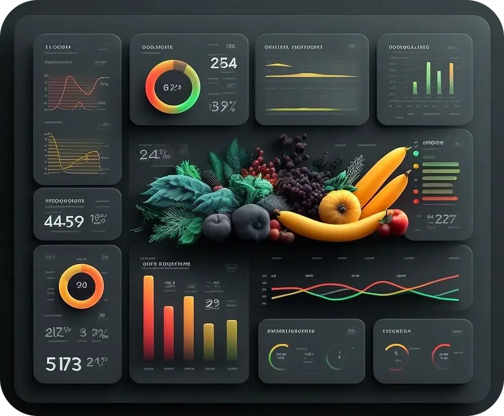
Let deep dive into it and see what it could get from various prompts. You can view and analyse some images obtained there. I played with Midjourney when creating interfaces and got stunningly beautiful results. In just a few minutes, I created smartwatch apps, taxi app designs, and a science app. We looked at what your boring dashboard with statistics would look like if it were designed by a neural network.
Here you can see some examples and prompts that I obtained. I understand that the results are still far from ideal, but it is a significant step in the near future.
Task 1. Create the grocery dashboard. (prompt example: beautiful HQ dashboard UI design, groceries, e-commerce, graphs, images, stats — v 4 — q 2).

Task 2. Food delivery app.

3. Just a mobile app.

4. Coffee shop app.

5. Marketplace dashboard.

6. Watch OS interface

Comments